
I picked three websites from the Brutalist websites page.
I chose them instinctively, I knew I wanted to pick one I found visually interesting, one that I found interesting in its functionality and appearance, and one that I entirely didn’t like.
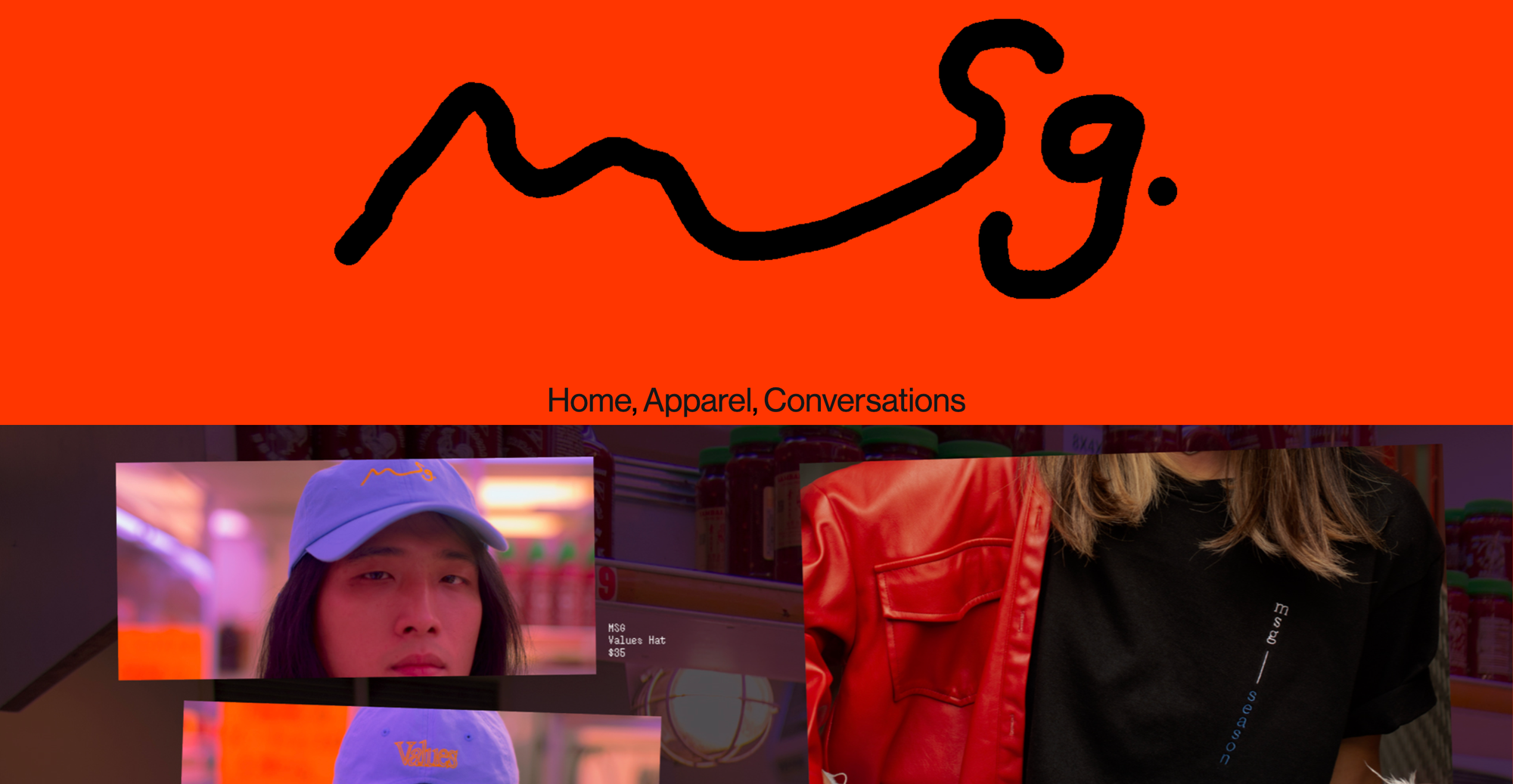
Made with Msg
On first viewing, this one I loved visually, the colours and type were very up my street and I was eager to see the functionality of the site. The site is for an Asian Contemporary fashion company, and has the functionality being able to purchase products but also includes interviews and conversations with notable people related to the brand. The brand describes itself as ‘Spicy’ and uses MSG as a big symbol in their brand. Their ‘conversations’ panel shines light on the experiences of being Asian and living in the US.
A site with animations such as this I feel haven’t necessarily made their way into mainstream sites. More mainstream fashion companies that are largely online based such as ASOS, stick to very basic website formatting to optimise user experience and functionality. Made with Msg utilises a cubed carousel to showcase images, alongside a moving banner at the header of the page with text on it, these moving parts combined with bold primary colours have the potential to date the site quite significantly, but paired with stylish photos and trending typefaces, it works quite well. The site is able to integrate their style into functionality, the linked buttons change typeface when hovered over with the cursor, and the cursor itself instead of the usual pointing finger, is a neon pink middle finger. The site itself is really only one page, with a scroll feature to navigate to the three categories available on the site. All in all, the site is functional and easy to navigate. The style of the page is I think specific to a taste that the demographic of the site would very much enjoy, it is expressive and maximalist to a large extent. It breaks alot of conventions with design, such as using a very varied array of typefaces throughout the site, but this in itself lends to the style the company is evidently very passionate about.
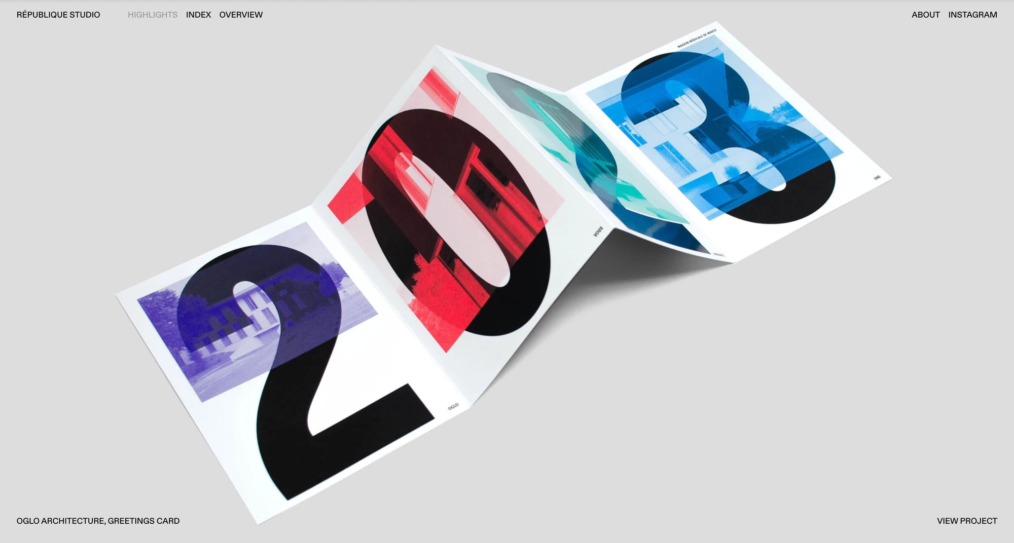
Republique Studio
This site relies on those instinctive gestures I had previously discussed regarding knowledge and time as a law of simplicity. The site showcases the design work of the Studio, so lets the work do the talking, the site acts as a vessel for the client work, so is clean and minimal, and it does so through the navigation controls also. To flick through what the studio deems their ‘best work’ the user only has to click, upon click the displayed work changes. In accordance to the laws of simplicity, it requires less time, so feels more simple. It can be argued the simplicity relies on having the knowledge that the image needs to be clicked on, because admittedly it took me a second to understand the functionality, but not too long of an amount of time for me to consider it a flaw.
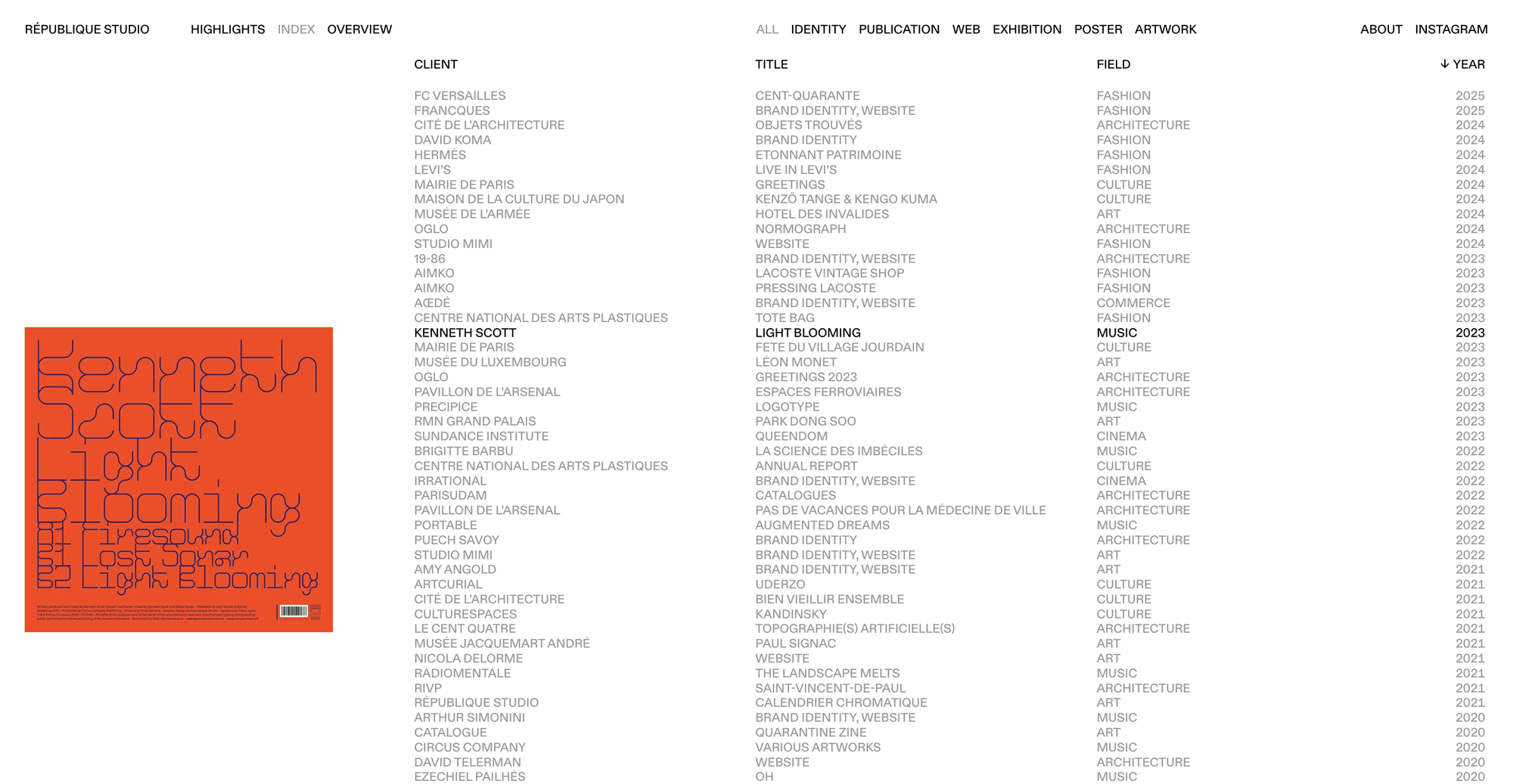
The index page I think is beautiful. It has an at first, very basic seeming alphabetised, chronological client list. However, upon hovering the cursor over each client, the rest go grey, which I think is a nice bit of interactivity that makes the website feel more considered. The way the image of the client work pops up on the left is also a feature I really loved. It adds simplicity to the site through both time and knowledge. The user saves time through flicking through client work because the don't have to click onto a whole new webpage to see client work that might only require a glance.
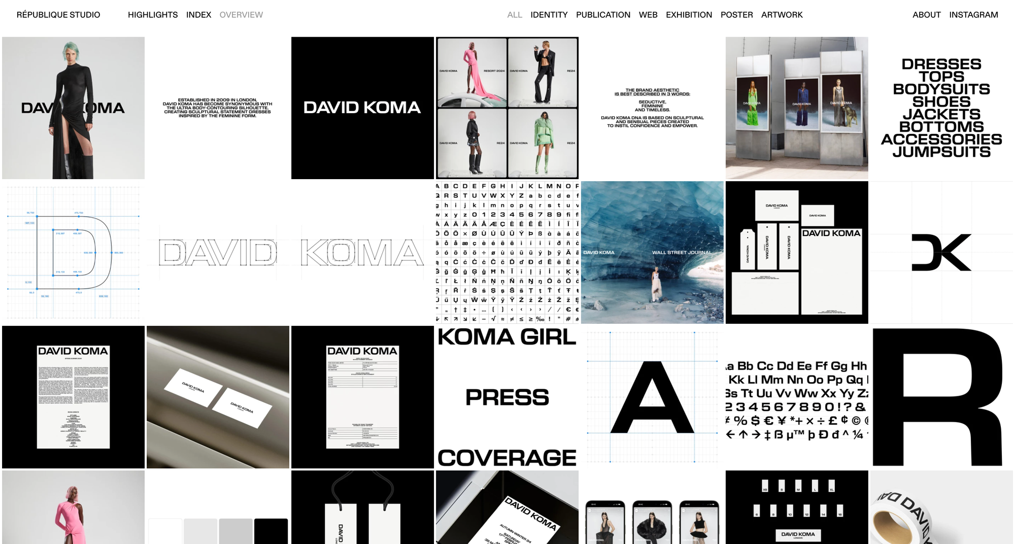
There is also, additionally to this, an overview page, which shows a moodboard of what the studio can create, and when hovered over the provenance of each photo. I think this website is beautifully crafted, and the more I have studied it, the more I think it is a brilliant example of optimising UX.
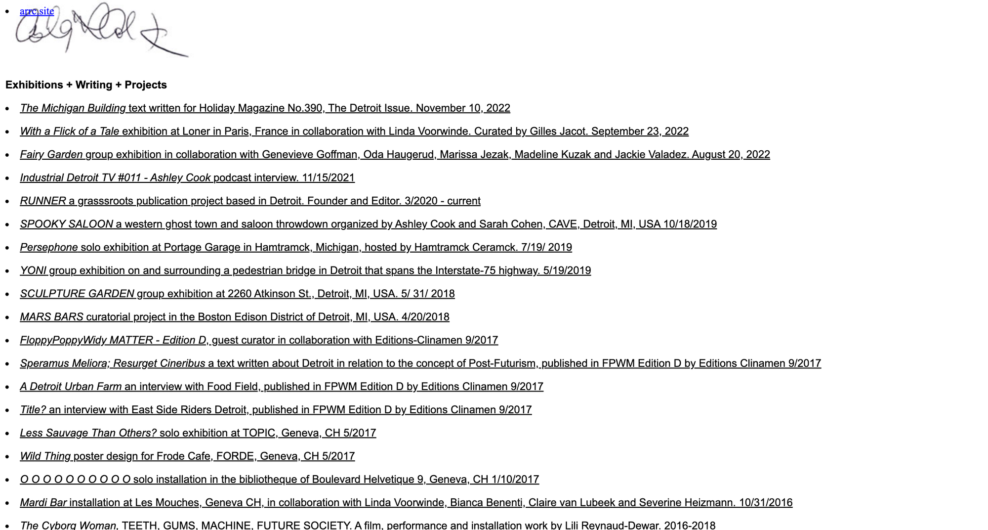
Ashley Cook
To give this site the benefit of the doubt, it is evidently there to serve the basic purpose of showcasing surrealist artist Cook’s work. From looking at the provenance of a lot of the articles linked within this, it has likely been live for the best part of this decade and further, which arguably accounts for the plainness of it. Similarly to Republique, it acts as a vessel that lets the art do the talking. The functionality of it is simply just a collection of links to articles of Cook’s work. My frustration that I have with the site is what a missed opportunity I can’t help feeling it is. Cook’s work is interesting and motivated by interesting concepts, and a site that represents this or even organises it would be brilliant for Cook’s image. The list on the site is a mixture of writings, exhibitions and podcasts, even just to categorise this would be a very welcome change to the site. An index system such as Republique’s would work spectacularly, giving the user an insight into what Ashley Cook’s work looks like without having to open up another tab and being redirected to a blog post or article. In terms of use of visuals even through type, the site doesn’t necessarily take advantage of it, it doesn’t feel the page is basic/minimal through creative liberty, but more so through efficiency and building a site that just gets the job done, but not to the most optimised extent it could be.